I rebuilt my blog with Astro. Goodbye Wordpress!
It had been coming for a long time. I had built and maintained a couple of Wordpress sites for years, including my dusty old blog site. I had almost forgotten it, but gotten reminded periodically by email that I should update this and that. Needless to say I had better things to do, but one day I noticed that the site wasn’t even up anymore! Shiit.
I didn’t want to start fixing the old site and end up having the same age-old blog up again, just waiting for the next troubles to arrive. So I decided to finally ditch it.
Astro to the picture
Instead, I wanted something fresh, minimalist, techie and inspiring. Astro seemed to be just that:
- It supports markdown —> Easy editing of blog posts
- It doesn’t need any monstreous engine with database —> No maintenance
- It generates a static site —> Cheap, fast and reliable hosting
- It has a superb developer expierience —> Fun and motivating
- It support dynamic custom components —> The sky is the limit
- And with a lot more features and benefits.
Let’s get started
I could have chosen the easy route and use one of the existing Astro Themes. But, instead, I wanted to maximize learning and build something that does exactly what I need and nothing else. After all, I had a hunch that this wasn’t going to be my last Astro site. I still have other Wordpress sites to modernize.
So, first things first, let’s install Node JS and then Astro. In the Terminal, run:
# Install Node Version Manager (https://github.com/nvm-sh/nvm#installing-and-updating)
curl -o- https://raw.githubusercontent.com/nvm-sh/nvm/v0.39.3/install.sh | bash
# Install the latest long-term support release of Node
nvm install --lts
# Create a new Astro project
npm create astro@latest
Follow the setup wizard:
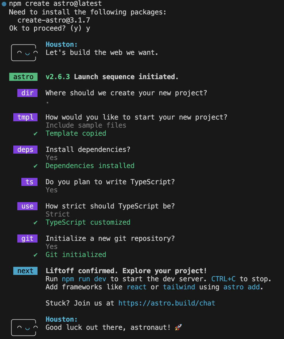
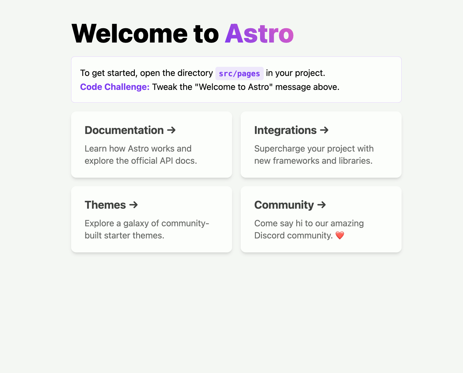
And finally, let’s run our site:
npm run dev
And voila! We have the first Astro website up:
Setting up the basic page layout
For building the layout, I chose to go with Tailwind CSS website, as it’s very lightweight, close to traditional CSS, but way easier to use.
So, let’s add Tailwind CSS using Terminal:
npx astro add tailwind
Then, get rid of all the Astro’s boilerplate <style> sections from all pages and layouts as we are to build the layout fully with Tailwind.
In the Layout.astro, we’ll set the background color, max width, height and centering of the container:
	<body class="bg-cyan-900">
		<div class="max-w-screen-2xl mx-auto bg-slate-100 min-h-screen">
            <slot />
		</div>
	</body>
Adding header and footer
Let’s add some reusable static texts into consts.ts:
export const SITE_TITLE = "My Blog";
export const SITE_DESCRIPTION = "My ramblings";
export const ABOUT_BLOG = "Ramdon fellow";
Then we are ready for creating our Header.astro and Footer.astro components into the /components folder:
---
const { title } = Astro.props;
---

<header class="px-[5%] bg-[#1F2A2F]/95 text-white h-12 items-center flex justify-between">
	<h2 class="uppercase inline pb-0 font-semibold">
		<a href="/">{title}</a>
	</h2>
	<nav class="uppercase">
		<a href="/">Home</a>
	</nav>
</header>
---
---
<footer class="text-center p-2 text-md">
© {new Date().getFullYear()}. All rights reserved.
</footer>
And finally compose them into the Layout.astro:
    <Header title={SITE_TITLE} />
    <slot />
    <Footer />
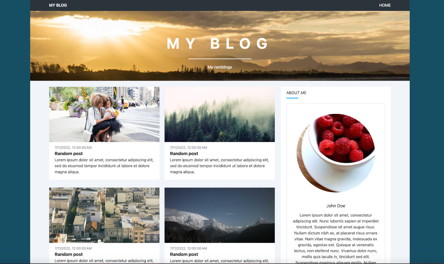
Improving the home page
First, let’s add a Hero section into the index.astro:
---
    // Import our static texts
    import { SITE_TITLE, SITE_DESCRIPTION, ABOUT_BLOG } from '../consts';
---
...
	<!-- Hero -->
	<div class="text-center text-white bg-[url('https://picsum.photos/seed/picsum/1600/400')] bg-cover p-1">
		<h1 class="md:text-6xl text-2xl uppercase tracking-[0.4em] font-bold pt-24 pb-8">{SITE_TITLE}</h1>
		<hr class="w-2/12 h-[2px] bg-white border-0 mx-auto" />
		<p class="pt-5 pb-10">
			{SITE_DESCRIPTION}
		</p>
	</div>
Then, we will create a blog post content collection and add blog posts onto the home page:
- Create a /content/blog folder and add some markdown files there, for example:
---
title: "Random post"
description: "Lorem ipsum dolor sit amet, consectetur adipiscing elit, sed do eiusmod tempor incididunt ut labore et dolore magna aliqua."
pubDate: "Jul 11 2022"
heroImage: "https://picsum.photos/800/400"
---

Lorem ipsum dolor sit amet, consectetur adipiscing elit, sed do eiusmod tempor incididunt ut labore et dolore magna aliqua. Vitae ultricies leo integer malesuada nunc vel risus commodo viverra. Adipiscing enim eu turpis egestas pretium. Euismod elementum nisi quis eleifend quam adipiscing. In hac habitasse platea dictumst vestibulum. Sagittis purus sit amet volutpat. Netus et malesuada fames ac turpis egestas. Eget magna fermentum iaculis eu non diam phasellus vestibulum lorem. Varius sit amet mattis vulputate enim. Habitasse platea dictumst quisque sagittis. Integer quis auctor elit sed vulputate mi. Dictumst quisque sagittis purus sit amet.
- Define the blog collection and the blog post schema in confit.ts under /content:
import { defineCollection, z } from "astro:content";

export const blogSchema = z.object({
  title: z.string(),
  description: z.string(),
  // Transform string to Date object
  pubDate: z
    .string()
    .or(z.date())
    .transform((val) => new Date(val)),
  updatedDate: z
    .string()
    .optional()
    .transform((str) => (str ? new Date(str) : undefined)),
  heroImage: z.string().optional(),
});

const blog = defineCollection({
  // Type-check frontmatter using a schema
  schema: blogSchema,
});

export const collections = { blog };
- Read the content collection on the index.astro page:
---
import { getCollection } from 'astro:content';

const posts = (await getCollection('blog')).sort(
	(a, b) => a.data.pubDate.valueOf() - b.data.pubDate.valueOf()
);
---
...
	<main class="md:grid md:grid-cols-12 md:gap-6 px-[5%] py-3">
		<section class="col-span-8 grid md:grid-cols-2 gap-5">
			{ posts.map(post => (
				<div class="bg-white mt-3">
					<a href={`/blog/${post.slug}`} class="block pb-5">
						<img src={`${post.data.heroImage}?random=${Math.random()}`} class="pb-3" />
						<div class="text-gray-500 text-sm px-[5%]">{post.data.pubDate.toLocaleString()}</div>
						<h1 class="font-bold text-lg px-[5%]">{post.data.title}</h1>
						<div class="px-[5%] block">{post.data.description}</div>
						</a>
				</div>
				))}
		</section>
	</main>
Adding a page and layout for showing blog post content
First, let’s create a layout for the blogposts as BlogPostLayout.astro:
---
import type { CollectionEntry } from 'astro:content';
import Layout from './Layout.astro';

type Props = CollectionEntry<'blog'>['data'];
const { title, description, pubDate, updatedDate, heroImage } = Astro.props;
---

<Layout title={title}>
	<main class="md:grid md:grid-cols-12 md:gap-6 px-[5%] py-3 bg-white">
		<article class="col-span-8 prose">
			<img src={heroImage} />
			{pubDate.toLocaleString()}
			<h1 class="font-bold text-3xl">{title}</h1>
			<slot />
		</article>
		<section class="col-span-4 mt-5">
		</section>
	</main>
</Layout>
Then, we will add a page for Blog posts (/pages/blog/[…slug].astro):
---
import { CollectionEntry, getCollection } from 'astro:content';
import BlogPostLayout from '../../layouts/BlogPostLayout.astro';

// Export static routes during build time for all the the posts
export async function getStaticPaths() {
	const posts = await getCollection('blog');
	return posts.map((post) => ({
		params: { slug: post.slug },
		props: post,
	}));
}
type Props = CollectionEntry<'blog'>;

const post = Astro.props;
const { Content } = await post.render();
---

<BlogPostLayout {...post.data}>
	<Content />
</BlogPostLayout>
For styling the blog posts, let’s use Tailwind Typography plugin:
npm install -D @tailwindcss/typography
- Add a tailwind.config.cjs file, with the following:
/** @type {import('tailwindcss').Config} */
module.exports = {
  content: ["./src/**/*.{astro,html,js,jsx,md,mdx,svelte,ts,tsx,vue}"],
  plugins: [
    require("@tailwindcss/typography"),
    // ...
  ],
};
Adding an About this blog section
The final part of the blog site is to add an About this blog section to the index.astro:
	<main>
        ...
		<section class="col-span-4 mt-3">
			<div class="bg-white px-[5%] py-3">
				<h2 class="uppercase mb-2">About this blog</h2>
				<hr class="border-0 bg-sky-400 h-1 w-12 mb-5"/>
				<div class="text-center border-2 border-gray-220 rounded-lg">
					<img src="https://picsum.photos/400/400" class="rounded-full p-[10%]" />
					<p class="px-[5%] py-3">
						{ ABOUT_BLOG }
					</p>
					<div class="bg-gray-200 rounded-b-lg p-3 mt-5 text-center">
					</div>
				</div>
			</div>
        </section>
	</main>
And, that’s it!
We have our first blog site with random images ready:
Final thoughts
Building a blog site with Astro and Tailwind is quite easy. Both have superb documentation and guidelines for getting things done. However, this is still a techie way of building a site. If you want to avoid the geekiness, I think safest is to find a fully managed platform like Wix or Wordpress.com.
I don’t recommend going half way with technology, like choosing a semi-managed Wordpress hosting, where you are still responsible for managing the plugins and upgrades. Spare the trouble, avoid your blog being hacked and either go with a static site approach, like this Astro example, or with a fully managed one.